There’s a renowned scene in British comedy that people have been laughing at for almost 40 years. If it happened for real, you’d cry.
I’ll say “chandelier” and anyone over the age of 35 will smile…
It’s the Only Fools and Horses sketch where Del Boy and Rodney wait patiently to catch a priceless chandelier as it’s removed from the ceiling. Except the ‘dipsticks’ hover underneath the wrong one and a second chandelier—originally out of shot—falls instead. To their horror, a thousand pieces of glass smash to the floor.
Why bring it up? Because that’s kind of what happens to the good intentions you have for your website when the copy doesn’t do its job.
That’s why I’m doing a series of teardowns. To talk about the times when bad copy can cause you to drop a potential new customer. (And that isn’t funny.)
Teardown #1: alltechishuman.com
What is it? An event for people who want the technology of the future to help us, not ruin us
Consider this:
My tagline is Making human connections in a digital world.
All Tech Is Human followed me on Twitter.
It feels instantly clear we’ll get along, no? And we do.
I got in touch with David Ryan Polgar who runs the All Tech Is Human event. When I asked if he’d be happy to be featured here, he said: “Tear it down!”
David speaks globally and writes frequently about free speech and hate speech. He brings tech and comedy together in a Funny As Tech panel show ← I’ve not seen that combo anywhere else. And he helps young people especially cope with a digital existence. One that can be overwhelming at times and affect your psychological well-being.
As the pace of digital development accelerates we need more people like David. We crave a place to talk about this stuff, which is why his conference is so important.
So the website exists to get more bums on seats.
^^ That’s always your first question and I’ll explain why.
Here comes the teardown…
First, consider the draw for your customer. What’s in it for them?
In the case of All Tech Is Human, ask yourself why you go to an industry event:
- To learn more about what’s happening in your industry
- To hear from people who inspire or challenge what you know already
- To meet people who are interested in the same things as you are
- To contribute ideas about how your industry can thrive
- To question how you feel about its development and the part you play in that
Any website promoting an event has to show people that this is what you get when you attend.
Home page teardown
This is the first thing I see when I go to the All Tech Is Human website:
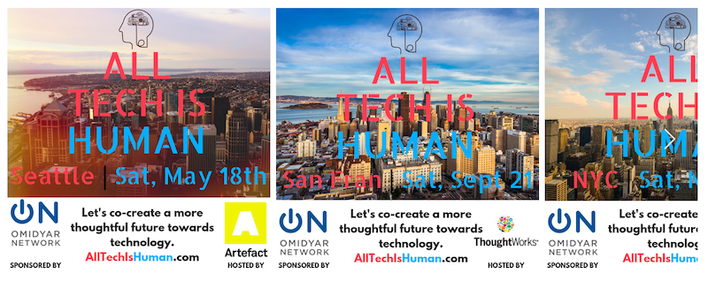
I see locations. I see dates. At the time, before I know what I know now, I’m guessing it’s some kind of event.
But guessing is (you guessed it) not good.
CRASH #1: If what you do isn’t immediately clear to the person visiting your website, there’s every chance they’ll close the browser and never come back.
Quick fix: Include a headline that screams ‘you don’t want to miss this!’
Second, there’s a lot of clutter here which dilutes the message:
- The images make it difficult to read the text. And this is just another opportunity for your message to be lost altogether like a warning in the wind.
- People can only take in one piece of information at a time too. Here, the same information is repeated three times, which stops you in your tracks when you want people to keep reading.
The ultimate goal is to keep moving your reader onto the next line until they click the ‘Get tickets’ link.
In reality, I still don’t know what is being advertised or if it’s for me.
This is what I see next:
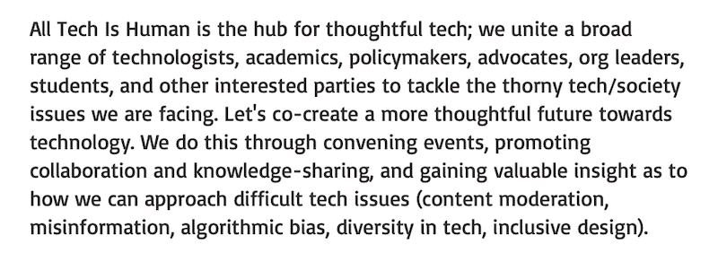
CRASH #2: People only turn to listen when you speak directly to them. If you don’t make it clear on your website who you’re talking to, it’s difficult to get their attention.
Quick fix: There isn’t one! You have to know your audience intimately.
It’s okay to say who they are. In this case, technologists, academics, and leaders of organisations. But what do they think about day to day? What do they worry about? What questions do they want answers to? What makes them extraordinarily happy or deeply sad?
This is the kind of thing you need to find out.
It makes the conversation you have with people so much richer.
I don’t go to the event because I’m an “interested party”. I go because I hate hate speech. I care that kids can get addicted to their devices. And as much as I get excited by the new developments in tech, it worries me that there’s so little guidance for how people should use it.
If I go to All Tech Is Human I want to know that this is the kind of stuff I’ll hear about –> this stuff exactly. As in, I’ve seen it mentioned in your web copy.
Now what do I do?
CRASH #3: If you don’t tell people what they have to do next — if you’re not clear — they won’t do it. So since the words you use hold power, use them to give your reader direction.
Quick fix: Establish one goal and stick to it.
Every web page has one goal. The goal of an events page is, ordinarily, to have people buy a ticket.
Following the principles of journalism, you can make sure you cover the basics to move someone through the page: what is it, when is it, where is it, etc. But it’s the ‘who is it for’ and the ‘why should you go’ that draws people in, so that they take action at the end and make the investment.
Being clear on who needs to be there
Current copy:
This event is for people who want to tackle “the thorny tech/society issues we are facing” like “content moderation, misinformation, algorithmic bias, diversity in tech, inclusive design”.
Revising the copy:
Consider how much your attendees are likely to know right now.
Do they understand why content moderation has to exist and do they already know there’s a lack of diversity in tech — or not?
Are they more worried that their family or friends will be duped by fake news, or are they fearful that AI can mass produce it?
The answers to questions like these lead you to copy for two different audiences looking for two different things. If you’re catering for one or for both, they each have to know you’ll cover the topics they care about.
TIP! If you cater to two different audiences, send them to separate parts of your website so they can focus on what’s relevant to them.
Being clear on why they should go
Current copy:
They’re building “a more thoughtful future towards technology” by “convening events, promoting collaboration and knowledge-sharing, and gaining valuable insight”.
Revising the copy:
Show me what a “more thoughtful future” looks like. What does it mean? Then I can decide if it’s something I want to be a part of.
If it is, how does sharing knowledge help us achieve it?
What counts as “valuable insight”?
Nobody wants to figure this out for themselves ― they won’t. Like the time I went to buy a new washing machine and nobody was free to demo it, so I left without buying a thing.
Once you’re clear on who should go and why they should go, finally you can tell them how to get a ticket.
Incidentally, this is what I see next on the All Tech Is Human home page — a link to order tickets. But I’m not convinced yet because I haven’t heard everything I need to hear.
CRASH #4: If you don’t show people something quickly online, they’re unlikely to see it at all. And you might not get another chance to prove yourself.
Quick fix: Go through your whole web page and throw out anything that’s getting in the way. Then check to see if there’s something important hiding at the bottom. (It happens a LOT.)
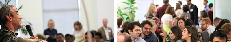
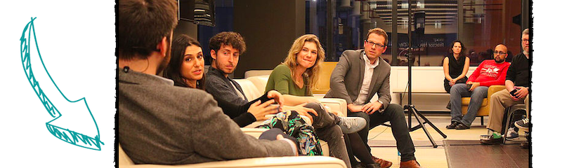
Here, I see photos that show the event is busy and people are engaged:
The speakers are booked, but there’s nothing to tell me what they’re speaking about or what I’ll learn:
Then there’s an audio recording of a fascinating, in-depth discussion that happened at last year’s event — BINGO! This is exactly the kind of talk I’d show up for, but it’s right at the bottom of the page under tons of other content. It’s the equivalent of having one of the best meals you’ve ever eaten but you waited an hour for your food to arrive.
You can lose people at any moment. Don’t wait to fix it!
All Tech Is Human isn’t a high ticket event. At $40 it’s totally accessible to just about anybody. There’s even a half-price ticket for students.
The thing is, I don’t know that unless I click on the link to get tickets.
If I don’t click on the link to get tickets, I will never know.
Then I’m gonna miss out on a fantastic event.
Getting the click is vital.
- Be immediately clear on what you’re offering
- Speak the same language as the person you want to attract
- Give direction — don’t leave people hanging, wondering what to do next
- Don’t hide the good stuff by introducing it too late
Extra tip:
If people visit your site but don’t buy, a quick survey or poll can help you find out why. Put this right there on the page, listen to what people tell you, and rectify any problems you uncover.
If you suspect you might be standing under the wrong chandelier, I can help.
Dig your heels in to tear down your online offer. Then build it back up to make it more persuasive. Get your results in just a few days: nataliesmithson.com/dig

Natalie is a copywriter working in AI. She’s creating an immersive exhibition experience for anyone who needs to know: better days will always come 🕯️ More posts
( ´ ∀ `)ノ~ ♡
0 comments on “Dig your heels in: All Tech Is Human”Add yours →